 There are many map visualisations out there, and most of them have appeared on LivingGeography over the years.
Parallel maps have been getting a lot of attention over the last few days as one of their latest projects (from October 2017), which maps census data on population structure has been more widely discovered.
It includes a 3D option with panning and tilting of the mapping.

The population pyramids are drawn instantly as the cursor is moved over a particular Census output area.
This allows for instant comparisons between different parts of a city, or urban/rural comparisons, or a look at how certain areas are attracting retirement populations.
Here's evidence of Student populations being concentrated in certain areas of Leeds - linked to the OCR 'B' Geography chapters that I wrote.
It's worth remembering that there are other Parallel map projects too - explore the whole website to find maps on air quality and other variables.

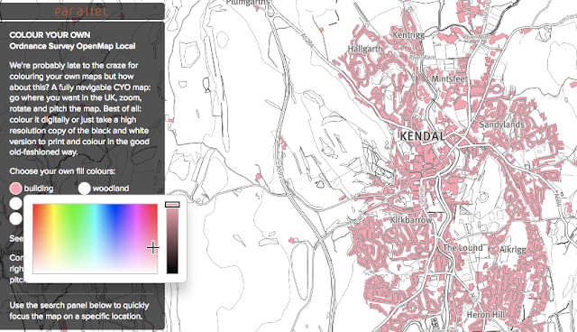
For example, how about these COLOUR IN YOUR OWN MAPS options.
Zoom to an area, and then use the buttons to identify a particular colour for it...

These maps can also be switched to other views.
Also try the RISK OF FLOODING maps, from April 2017, which are particularly useful when exploring flood risk topics with students.

There are plenty more.... Lovely work by the folks at Parallel...
Comments